Nike NBA City Edition Uniforms Unveiled in Honor of the 75th Anniversary Season
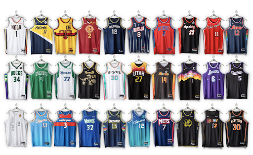
Image Courtesy of NBA.Com
By Angela Hickey
In honor of the NBA’s 75th Anniversary season, the NBA and Nike unveiled their all-new 2021-22 Nike NBA City Edition uniforms on the anniversary of the first-ever NBA game played between the New York Knicks and the Toronto Huskies on November 1, 1946.
Each NBA City Edition team uniform represents the mixtape of ultimate basketball moments—a compilation of the franchise’s greatest hits through the years in every design. Beyond some of the more obvious design elements, the uniforms include many subtle touches and “easter eggs” that highlight pivotal moments from each team’s history. City Edition uniform is supported with an integrated Game Theater collection and, for 16 teams, a court design that provides the ultimate platform to showcase the uniforms.
Lower 5
30. Oklahoma City Thunder
While I liked the offset vertical lettering OKC has here, they have used it a few times in the past. Also, compared to the other iterations which all incorporated color in some way, this year’s completely white look is rather boring compared to many of the others.
29. Miami Heat
The Heat were long the standard of the City Edition jerseys, but this year’s style seems rather messy. The idea behind this jersey is actually pretty cool, with the mashup of letters from jerseys of the past, but the overall execution is rather messy and unorganized.
28. Phoenix Suns
This jersey would have been higher on the list if it wasn’t nearly identical to last year’s design. I can’t blame Phoenix for going this route—the design is interesting and the colors catch the eye—but its recycled pattern makes it feel unoriginal.
27. Boston Celtics
Boston has kept a traditional route throughout the team’s entire career, and this jersey is no different. This is one of those NBA city edition jerseys that feels like you pulled something out of the very back of your closet and thought you’d take it for a spin since you haven’t worn it in a while. Though it is meant to be a callback to the team’s classic past, with retired players’ jersey numbers on the bottom, the lack of courage in the design makes it feel boring.
26. Washington Wizards
While this look is very clean and fits the aesthetic of their two other jerseys, the Washington Wizards jersey does not really have much else going for it. It does not set itself apart enough from the regular jerseys of the team. I wish that they took the design and made it stand out a little bit more.
Many of the middle spots are fairly interchangeable. A good portion sport rather simple, classic designs that do not really stand out among the pack. The Top 5, however, are the one’s I feel displayed the most originality and overall best designs.
Top Five
5. Minnesota Timberwolves
While I enjoy the colors and the design of this jersey, there are still certain aspects that I felt could have been altered. The stripes on the side are interesting but the more I look, the harder it is to tell if I like the side panel or not. So, while it does rank high on the list, there could have been some serious design changes that made it a real showstopper.
4. Orlando Magic
The design is creative, and the orange and black attracts my attention in a good way. This design builds on last year’s set by inverting the colorway and changing the logo. Overall, the design does a good job standing out compared to the competition.
3. Los Angeles Clippers
Since the team moved to L.A. they have not used light blue as their main color, but they have been dabbling with the franchise’s traditional colors in recent years. The orange and blue accents really attract attention and the classic design makes it pleasing to the eye. Compared to the other traditional sets in the collection, this one stands out as the best among them.
2. San Antonio Spurs
The blue, pink, and orange add some much needed pop to what is one of the most bland jersey’s in sports. The design does a good job incorporating the spur logo in its final iteration and it is much more creative than the other sets. Although I would have liked to see the jersey get a little more color, I feel that the mild accents suit this design well.
1. Toronto Raptors
Utilizing simple colors and interesting designs, the Raptors jersey is the most eye-catching of them all. The gold raptor on a black background really stands out and sets it apart from the other designs. The gold and black is also a reference to one of their biggest fans, rapper Drake, whose OVO owl brand is in black and gold. Although it would have been intriguing to see the teams’ purple incorporated with this jersey as a callback to the 90s, I think that design would have been much too busy.